
Themes
How themes work in the RVE SDK and which CSS variables you can override
The RVE SDK has a theme system for the full editor UI. A theme sets the colors of the panels, backgrounds, borders, timeline items, and controls. You change a theme with CSS variables. You do not change the SDK components.
Built-in Themes
The SDK has three built-in themes:
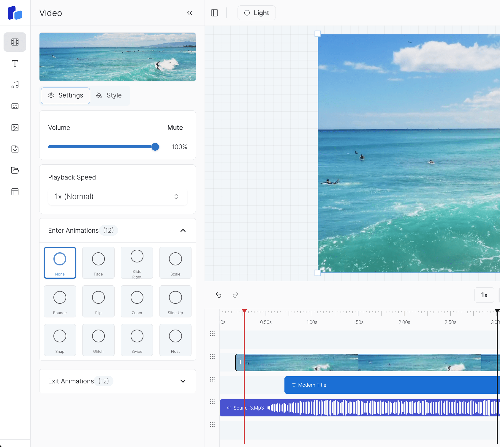
Light
Theme id: light
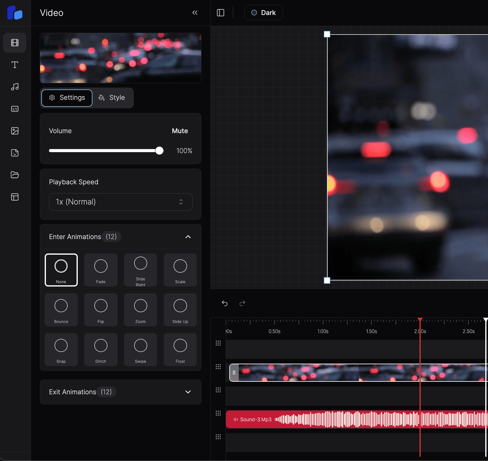
Dark
Theme id: dark (default)
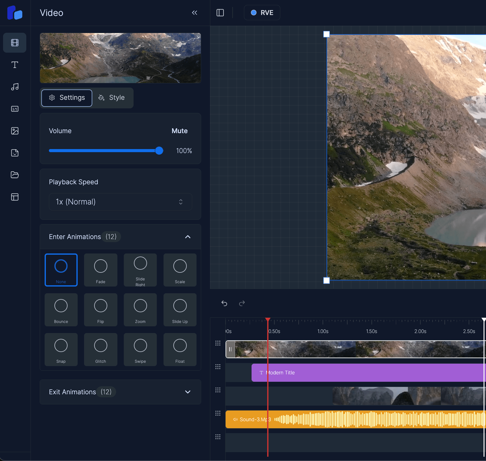
RVE
Theme id: rve
The editor starts with the dark theme. Use the defaultTheme prop to start with a different theme.
How Theming Works
The theme system has these parts:
- The SDK stylesheet (
@reactvideoeditor/react-video-editor/styles.css) defines a set of--rve-*CSS variables for each built-in theme. - The editor root element has a
data-rveattribute. The SDK sets adata-rve-themeattribute with the active theme id on this element. - Each theme is a CSS rule that matches
[data-rve][data-rve-theme='<id>']. The rule sets the values of the--rve-*variables. - All editor components read their colors from the
--rve-*variables.
/* The SDK stylesheet contains rules like this one. */
[data-rve][data-rve-theme='dark'] {
  --rve-background: var(--rve-base-950);
  --rve-foreground: var(--rve-base-200);
  --rve-primary: var(--rve-primary-600);
  --rve-border: var(--rve-base-800);
}
The theme attribute is on the editor root only. The SDK does not add a class or an attribute to the <html> element. Thus, the editor theme does not change the rest of your page.
When the user selects a theme in the theme dropdown, the SDK changes the data-rve-theme value. The CSS variables change immediately. The SDK also keeps the selection in localStorage (key rve-extended-theme). On the next load, a valid saved theme replaces defaultTheme.
The SDK stylesheet is precompiled
The SDK stylesheet is a compiled CSS file. You cannot edit the SDK styles.css, the theme files, or the SDK Tailwind configuration in node_modules. To change a theme, add your own CSS file. See Override theme variables.
Tailwind Classes in Your App
The SDK compiles its Tailwind classes with the rve prefix (for example, rve:bg-primary). This prevents conflicts with the Tailwind classes of your app.
Thus, a class such as bg-primary in your app does not use the RVE theme. It uses the theme of your app. If a component of your app must use an RVE color, read the variable directly:
<div style={{ background: 'var(--rve-primary)', color: 'var(--rve-primary-foreground)' }} />The --rve-* variables have values only inside the editor root element ([data-rve]). Use them only in components that you put inside the editor, for example a customSidebar or a sidebarLogo.
Override Theme Variables
To change a built-in theme or to add a new theme, do these steps:
- Create a CSS file in your app.
- Write a rule for the theme id. Use the selector
[data-rve][data-rve-theme='<id>']. - Import your CSS file after the SDK stylesheet.
/* Change the primary color of the built-in dark theme. */
[data-rve][data-rve-theme='dark'] {
  --rve-primary: hsl(156 80% 40%);
  --rve-ring: hsl(156 80% 40%);
  --rve-sidebar-primary: hsl(156 80% 40%);
}import '@reactvideoeditor/react-video-editor/styles.css';
import './rve-overrides.css';To add a new theme with its own id, see Whitelabelling.
Use the full selector
Use [data-rve][data-rve-theme='<id>']. A rule on :root or on html does not change the editor, because the SDK sets the variables on the editor root element.
Theme Variable Reference
All variables use the --rve- prefix. Most color variables have a -foreground pair for the text and icons on that color.
Color scales
| Variable | Use |
|---|---|
--rve-base-50 to --rve-base-1000 | The neutral scale (50, 100, 200 ... 950, 1000). Most surface, text, and border variables refer to this scale. |
--rve-primary-50 to --rve-primary-1000 | The brand color scale. --rve-primary, --rve-ring, and the chart colors refer to this scale. |
Core UI colors
| Variable | Use |
|---|---|
--rve-background, --rve-foreground | The main editor background and text. |
--rve-card, --rve-card-foreground | Cards and panel sections. |
--rve-popover, --rve-popover-foreground | Dropdowns, menus, and popovers. |
--rve-primary, --rve-primary-foreground | Primary buttons and active controls. |
--rve-secondary, --rve-secondary-foreground | Secondary buttons. |
--rve-muted, --rve-muted-foreground | Muted backgrounds and secondary text. |
--rve-accent, --rve-accent-foreground | Hover and selected states of menu items. |
--rve-destructive, --rve-destructive-foreground | Delete actions and errors. |
--rve-success, --rve-success-foreground | Success states. |
--rve-warning, --rve-warning-foreground | Warnings. |
--rve-info, --rve-info-foreground | Information states. |
--rve-highlight, --rve-highlight-foreground | The zoom target handle and the selected animation. |
--rve-border | Borders. |
--rve-input | Input fields. |
--rve-ring | Focus rings. |
--rve-chart-1 to --rve-chart-5 | Chart colors in the editor UI. |
Sidebar
| Variable | Use |
|---|---|
--rve-sidebar, --rve-sidebar-foreground | The sidebar background and text. |
--rve-sidebar-primary, --rve-sidebar-primary-foreground | The active sidebar item. |
--rve-sidebar-accent, --rve-sidebar-accent-foreground | Sidebar hover states. |
--rve-sidebar-border, --rve-sidebar-ring | Sidebar borders and focus rings. |
Text, surfaces, and states
| Variable | Use |
|---|---|
--rve-text-primary, --rve-text-secondary, --rve-text-tertiary | The levels of text emphasis. |
--rve-text-disabled, --rve-text-placeholder | Disabled text and placeholder text. |
--rve-surface, --rve-surface-elevated, --rve-surface-overlay | Surface layers. |
--rve-interactive-hover, --rve-interactive-pressed, --rve-interactive-disabled | Hover, pressed, and disabled backgrounds. |
Floating toolbar
The floating toolbar is the selection toolbar and the canvas zoom controls.
| Variable | Use |
|---|---|
--rve-floating-toolbar-bg, --rve-floating-toolbar-border, --rve-floating-toolbar-shadow | The toolbar background, border, and shadow. |
--rve-floating-toolbar-text, --rve-floating-toolbar-text-hover, --rve-floating-toolbar-hover-bg | Toolbar icons and hover states. |
--rve-floating-toolbar-divider | Dividers between toolbar groups. |
--rve-floating-toolbar-lock-active | The active lock button. |
Timeline items
| Variable | Use |
|---|---|
--rve-video-overlay, --rve-video-overlay-foreground | Video items. |
--rve-video-item, --rve-video-item-foreground | A video item before its thumbnails load. |
--rve-audio-overlay, --rve-audio-overlay-foreground | Audio items. |
--rve-text-overlay, --rve-text-overlay-foreground | Text items. |
--rve-image-overlay, --rve-image-overlay-foreground | Image items. |
--rve-caption-overlay, --rve-caption-overlay-foreground | Caption items. |
--rve-caption-item, --rve-caption-item-foreground | Caption words in the timeline. |
--rve-caption-item-active, --rve-caption-item-active-foreground | The active caption word. |
--rve-waveform-bar, --rve-waveform-bar-foreground | Audio waveform bars. |
Timeline
| Variable | Use |
|---|---|
--rve-timeline-marker, --rve-timeline-marker-hover | The playhead marker. |
--rve-timeline-tick, --rve-timeline-tick-hover | Ruler ticks. |
--rve-timeline-ghost | The ghost item that shows during a drag. |
--rve-timeline-row | Track rows. |
--rve-timeline-selected-border, --rve-timeline-item-selected-border | The borders of selected items. |
--rve-timeline-handle-bg, --rve-timeline-handle-indicator, --rve-timeline-handle-hover | The timeline resize handle. |
--rve-keyframe-pink, --rve-keyframe-pink-hover, --rve-keyframe-slate | Keyframe markers. |
Corner radius
| Variable | Use |
|---|---|
--rve-radius | The base corner radius (default 9px). |
Removed variables
Version 5.14 removed the --rve-sticker-overlay and --rve-sticker-overlay-foreground variables, because the SDK no longer has stickers. If your CSS sets these variables, you can delete those lines.
Summary
- Themes are sets of
--rve-*CSS variables. - The SDK sets
data-rve-themeon the editor root element, not on<html>. - To change a theme, import your own CSS file after the SDK stylesheet.
- Use the selector
[data-rve][data-rve-theme='<id>']. - The SDK Tailwind classes have the
rveprefix, so the Tailwind classes of your app do not change.