
Whitelabelling
Add your own theme and logo to the RVE SDK editor
If you add RVE to your product, you can make the editor look like a part of your own brand. You can set your own colors, your own theme list, and your own logo.
Use whitelabelling for these cases:
- Your product has brand guidelines for colors and spacing.
- You show the editor on a separate page, for example an
/editorroute. - Your customers create branded videos in an editor that must look like your product.
Example Whitelabel
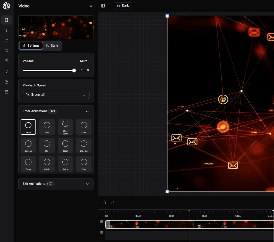
This example shows RVE with a theme that matches the OpenAI design system. The editor uses a dark theme, the OpenAI color palette, and familiar design patterns.
How to Whitelabel RVE
Read Themes first. It explains the --rve-* variables and the data-rve-theme attribute.
Step 1: Create a Theme File
Create a CSS file in your app. Write a rule for your theme id with the selector [data-rve][data-rve-theme='<id>']. This example uses the id my-brand.
[data-rve][data-rve-theme='my-brand'] {
  /* Brand color */
  --rve-primary: hsl(156 80% 40%);
  --rve-primary-foreground: hsl(0 0% 100%);
  --rve-ring: hsl(156 80% 40%);

  /* Surfaces and text */
  --rve-background: hsl(0 0% 100%);
  --rve-foreground: hsl(240 10% 10%);
  --rve-card: hsl(0 0% 98%);
  --rve-popover: hsl(0 0% 100%);
  --rve-popover-foreground: hsl(240 10% 10%);
  --rve-border: hsl(0 0% 90%);

  /* Sidebar */
  --rve-sidebar: hsl(0 0% 100%);
  --rve-sidebar-foreground: hsl(240 10% 10%);
  --rve-sidebar-primary: hsl(156 80% 40%);
  --rve-sidebar-primary-foreground: hsl(0 0% 100%);

  /* Corner radius */
  --rve-radius: 6px;
}
A new theme starts with the values of the built-in light theme. Set each variable that must be different. For a dark brand theme, set the surface, text, border, and sidebar variables. See the theme variable reference for the full list.
Step 2: Import the Theme File
Import your theme file after the SDK stylesheet:
import '@reactvideoeditor/react-video-editor/styles.css';
import './my-brand-theme.css';
You cannot add the file to the SDK styles.css. The SDK stylesheet is a compiled file in node_modules.
Step 3: Register the Theme
Give the theme to the editor with the availableThemes prop. Each theme has these fields:
| Field | Type | Description |
|---|---|---|
id | string | The theme id. It must be the same as the id in your CSS selector. |
name | string | The name in the theme dropdown. |
color | string | Optional. The color swatch in the theme dropdown. |
icon | ReactNode | Optional. An icon for the theme. |
className | string | Deprecated. The SDK does not use this field. |
If you show only your own themes, set showDefaultThemes={false}. Also set defaultTheme to your theme id. If you do not set it, the editor starts with the dark theme.
'use client';

import { ReactVideoEditor } from '@reactvideoeditor/react-video-editor/react-video-editor';

const brandThemes = [
  {
    id: 'my-brand',
    name: 'My Brand',
    color: '#14b87a',
  },
];

export default function EditorPage() {
  return (
    <main style={{ height: '100vh' }}>
      <ReactVideoEditor
        projectId="your-project-id"
        fps={30}
        availableThemes={brandThemes}
        showDefaultThemes={false}
        defaultTheme="my-brand"
      />
    </main>
  );
}
If users must not change the theme, set hideThemeToggle. The editor then hides the theme dropdown and always uses defaultTheme.
<ReactVideoEditor
  projectId="your-project-id"
  availableThemes={brandThemes}
  showDefaultThemes={false}
  defaultTheme="my-brand"
  hideThemeToggle
/>
Step 4: Add Your Logo
Use the sidebarLogo prop to replace the RVE logo:
'use client';

import { ReactVideoEditor } from '@reactvideoeditor/react-video-editor/react-video-editor';

const brandThemes = [{ id: 'my-brand', name: 'My Brand', color: '#14b87a' }];

export default function EditorPage() {
  return (
    <main style={{ height: '100vh' }}>
      <ReactVideoEditor
        projectId="your-project-id"
        fps={30}
        availableThemes={brandThemes}
        showDefaultThemes={false}
        defaultTheme="my-brand"
        sidebarLogo={<img src="/my-logo.svg" alt="My Brand" width={24} height={24} />}
      />
    </main>
  );
}
The logo shows in these locations:
- The top-left corner of the sidebar on desktop screens.
- The editor header on mobile screens, where the sidebar is hidden.
You can use any React node as the logo, for example an <img>, an SVG component, or an icon from an icon library. Keep the logo small. The mobile header shows it in a 24 × 24 px box.
Step 5: Style Your Own Components
The SDK Tailwind classes have the rve prefix. Thus, a Tailwind class such as bg-primary in your app does not use the RVE theme.
If you put your own components inside the editor (for example a customSidebar), use the --rve-* variables for colors. Then your components change with the editor theme:
<div
  style={{
    background: 'var(--rve-card)',
    color: 'var(--rve-foreground)',
    borderColor: 'var(--rve-border)',
  }}
/>
Notes
- You can add more than one brand theme. Each customer or workspace can have a different theme.
- The editor keeps the last theme that the user selected in
localStorage. If the saved theme id is in the theme list, the editor uses it in place ofdefaultTheme. - Use the
onThemeChangeprop to get the new theme id when the user changes the theme.